
Vastu vs Your Taste: Does Your Wall Art Really Have to Match?
12 September 2026
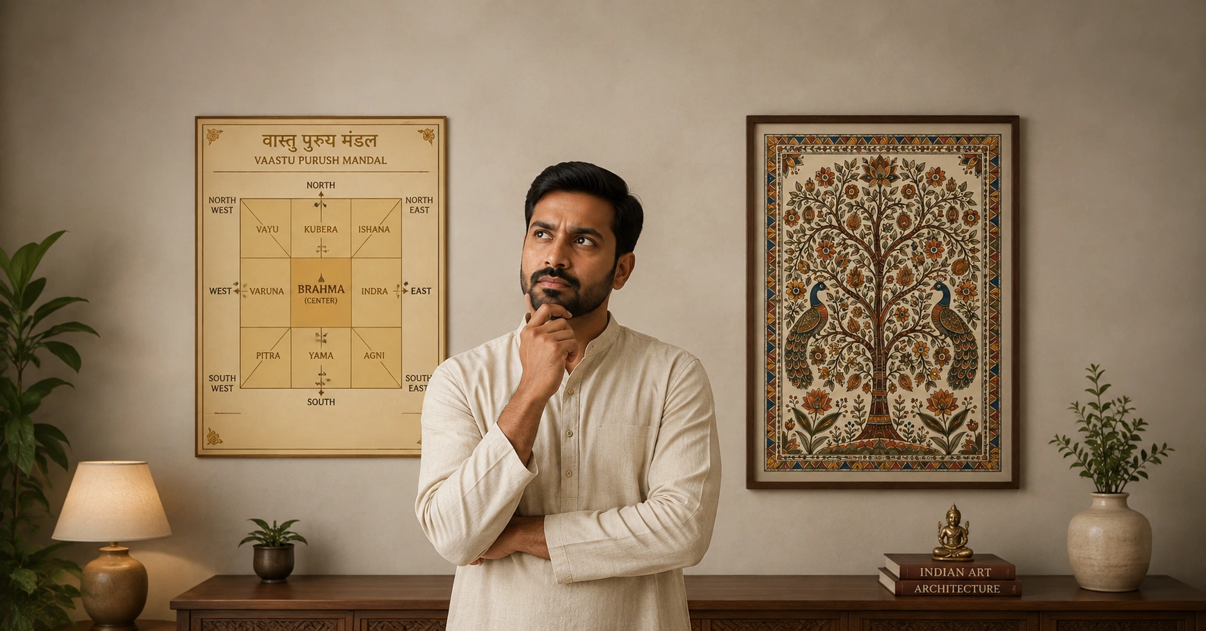
You find a painting you love. The colours work, the piece feels like you, and you can already see it on the wall opposite the sofa.
Then a relative asks whether it's Vastu-friendly, and a simple decision stops being simple. This is the most common hesitation people have when choosing Vastu wall art for an Indian home - not price, not size, but whether personal taste and traditional guidance are about to disagree.
The two obvious answers aren't helpful. Please ignore Vastu entirely, or hand the decision to the checklist someone forwarded on WhatsApp.
There's a better way through, and it starts with actually knowing what the guidance says. Interpretations vary among practitioners, regions, and families, so what follows is a general pattern rather than a fixed rulebook.
The principle underneath it
Vastu treats direction as the organising idea. The same painting can be well placed on one wall and poorly placed on another, which is why so many apparent conflicts turn out to be solvable by moving something.
North and east are associated with prosperity and new beginnings. Water imagery, greenery, lotus and sunrise scenes are commonly placed here - water in particular is kept to the north or east rather than the south.
South and west are associated with stability. Mountains, earth tones and grounded imagery suit these walls, which is where the convention of hanging mountains behind a desk or seating area comes from - support at your back.
Some subjects are avoided on any wall. Violence, decay, dying plants, isolation, anything sinking or falling. The thread running through them is fairly clear - these are images of things going wrong, and the tradition treats what you look at daily as something that shapes the room.
Notice how much of this overlaps with ordinary design sense. Calm art where you sleep, energy where you gather, something settled behind your chair - an interior designer would recommend most of it without mentioning Vastu at all.
Room by room
Nobody thinks about their house in compass points. They think in rooms. Here's how it translates.
Puja room
North or east, and this is the placement people are strictest about by a distance.
Deity images should face into the room rather than towards a wall or a door, hang at or above eye level, and stay off any wall that adjoins a bathroom. Nothing directly beneath a staircase or a beam.
Divine Durga Darbar and Panchmukhi Hanuman both have the presence a dedicated space asks for.
If your flat has no separate puja room - which is most flats- a devotional painting in the north-east corner of the living area is a common and accepted solution. Worth knowing that a painting isn't treated the way a murti is: no daily ritual, no obligation, no worry about whether it's being properly tended. That's precisely why it works in a room that isn't a puja room.
Kitchen
The kitchen belongs to the fire element and the south-east, and it carries one rule people are surprised by: water imagery is avoided here. Lakes, rivers and rain scenes are held to work against the fire, so they belong somewhere else in the house.
Kitchens have less spare wall than other rooms, so what goes up tends to be small. The traditional preference is abundance - fruit, grain, greenery, anything suggesting nourishment.
If your kitchen has a free wall and you'd like something from our collection, a compact botanical works: Silent Leaf Study or Violet Cineraria Bloom, kept away from the cooking zone where heat and steam reach. Both sit comfortably within the guidance, and greenery is genuinely part of what the tradition favours here.
Study or workspace
North or east for concentration.
Two conventions worth knowing. Saraswati is traditionally associated with learning, which makes Veena Vahini Saraswati the obvious choice above a study desk. And grounded imagery behind your chair is read as support at your back - something structured like Poise in Geometry or Desert Balance does that job without competing for attention while you work.
If the work is commercial rather than academic, Padma Lakshmi – Lotus of Abundance is a common pick for a home office.
Living room
The most relaxed room in the house, and where your own taste gets the most say.
Nature, landscapes, water and scenes of community all sit well. Water-based work is best on a north or east wall, so Whispers Across the Lake or Lotus Pond Stories want that side of the room. Folk work like Circle of Life in Warli Village brings celebration and community imagery, which suits a space the whole household uses.
It's also the right room for anything bold. Happy Shapes - Dopamine Abstract Triptych has genuine energy in it, and a living room can take that in a way a bedroom can't.
Bedroom
Calm subjects, and paired rather than solitary imagery - a lone bird or single figure is sometimes avoided on the reasoning that a shared room suits pairs better. Deity images generally stay out.
Soft botanicals and quiet landscapes are the safest ground: Quiet Botanicals, Violet Cineraria Bloom, or Quiet Horizon – Abstract Landscape Triptych Set above the bed.
For a couple's room, Eternal Union – Radha Krishna in Bloom sits in an interesting middle space - devotional in subject, but read by many households as an image of union rather than one needing puja-room treatment. Worth checking against how your own family sees it.
Entrance
Welcoming and auspicious. Ganesha at the threshold is the most familiar convention anywhere in Indian homes, and Ganpati's Journey to Kailash is made for that spot.
Tree-of-life imagery suits an entrance too, carrying growth and continuity - Tree of Life - Guardian of the Forest or Birdsong in the Tree of Life, neither of which needs the placement care a deity image does.
Dining room
Abundance again, so the same honest answer as the kitchen: fruit and grain imagery isn't something we stock. Botanicals and garden scenes are the nearest fit - Lotus in Bloom, or Tropical Bloom Symphony if you've got a long wall.
What's generally avoided anywhere
A short list, and it's shorter than people expect: scenes of conflict or violence, decay, wilting or dead trees, isolation, and imagery of sinking or falling.
That's the actual concern. Not colours, not styles, not abstraction - subjects that carry a sense of loss or struggle.
Notice how much of the rest overlaps with plain design sense. Calm art in bedrooms, energy in living rooms, something settled behind your desk. An interior designer would recommend most of it without ever mentioning Vastu.
Where it genuinely clashes
Three situations come up again and again.
You love abstract art. Abstract work has no identifiable subject, so a subject-based checklist has nothing to say about it. That's an absence of guidance, not a prohibition. People who follow Vastu and also like abstract work tend to apply the principles that still make sense - colour and mood - and let the rest go.
You love dark or dramatic work. The tradition does caution against gloomy imagery, and this is where checklists misfire most. Two different things get confused: a deep blue abstract reads as calm, a charcoal composition reads as elegant. Neither is gloomy in the sense the guidance means. The concern is subject and mood, not how dark the paint is.
The piece means something to you and fits nothing. No lotus, no deity, no sunrise. It reminds you of a place, or a time in your life, or you simply can't stop looking at it. There's no category for that, and the tradition isn't really built to settle it. That one's yours to decide.
When the piece you want doesn't fit
This is the part most articles skip, and it's the reason people search in the first place.
Move it rather than reject it. Most objections are about direction, not the artwork. A piece that's questionable on a south wall may be fine on a north one. Work out whether the problem is the painting or the spot you'd picked for it.
Change the room. Something that raises eyebrows in a bedroom is often unremarkable in a study or hallway. Bedrooms attract the most caution because they're where you sleep; other rooms are treated far more loosely.
Look for the same feeling elsewhere. If a piece appeals for its mood rather than its content, another one usually delivers that mood without the conflict. Someone drawn to a stormy seascape usually likes a calm one just as much - what pulled them in was the scale and the mood, not the weather.
Ask what exactly is being objected to. "It's not Vastu-friendly" is rarely a complete answer. Is it the subject, the direction, the colour, the room? Once it's specific, it's usually solvable. Often it's something they heard once and never questioned.
Or decide it doesn't apply here. Plenty of families follow Vastu selectively - careful about the puja room, relaxed about everything else. That's a real position, not a compromise.
Two things worth saying plainly
Vastu-friendly doesn't mean good. A piece can satisfy every recommendation and still be the wrong size for the wall, clash with the room, or just be boring. Ticking boxes isn't choosing well, and you'll be looking at this thing every day for years.
Following Vastu doesn't mean an old-fashioned house. Botanicals, landscapes, abstract work and contemporary takes on Indian themes all sit comfortably inside the guidance. Nature imagery in particular is both traditionally favoured and one of the most versatile categories in modern interiors - which is less a coincidence than it looks. Both systems are asking the same question in different words: what does this do to the room, and how do the people in it feel?
A sensible order to do it in
Start with what you actually like. Shortlist pieces that appeal to you before applying a single restriction - beginning from a list of rules produces homes that look like compliance exercises.
Then check the subject, since that's what the guidance responds to. Then pick the room and the wall, which is where most conflicts quietly resolve themselves.
And last, check how it makes you feel standing in front of it. That's the part you'll still be registering in year five, long after everyone's stopped asking about the direction.
Your house, your call
Vastu gives you a framework. Design gives you principles. Neither one hands you a finished answer.
If it matters to your family, take it seriously and learn what it actually says rather than following a graphic someone forwarded. If it doesn't, choose freely. And if you're somewhere in between - which is most people - use both as inputs and let neither one have the final word.
Have a look through the Kalakraft collection with your own rooms and directions in mind. The piece you want usually fits better than you'd feared.
Vastu Shastra is a traditional belief system rather than a scientifically established method. Recommendations vary between practitioners and regions.